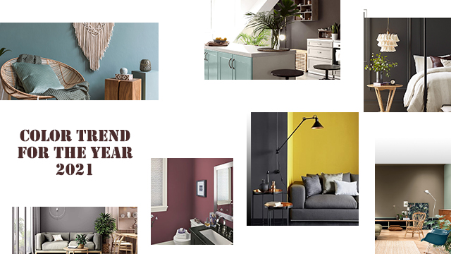
The color trend for the year 2021 is operationally bringing nature indoors. In a way, the entire direction of the palette is warm and grounded. Rich yet soft, moody yet uplifting, these deep shades are perfect for bringing a sense of well being to any indoor. Taking inspiration from the current trend in designs, these fresh hues from the landscapes are the top pick for the year 2021. The popular paint companies, I,e., Benjamine Moore, Sherwin-Williams, and PANTON, have published this comforting and earthy palette of colors. The colors from the palette are an antidote to the era of the cool grays from previous years.

Colors by Benjamin Moore :
It is time to reset and reflect the balance and bring natural harmony to Interiors. The warmer tones selected by Benjamin Moore, are true vibes, that radiates sanctuary and well being.

Aegean Teal 2136-40 (R G B – 111:137:139 / L R V: 23.96); This muted hue has a blend of blue-green and gray that creates natural harmony in the space. It is a cozy and relaxing fresh color that can be used in any area.
Amazon Soil 2115-30 (R G B – 112:93:94 / L R V : 11.68) ; Amazon soil is a shade of deepest mauve that combines with a velvety touch. It is the most dramatic hue that inspires a sense of tranquility.
Potters Clay 1221 (R G B – 187:136:103 / L R V : 27.23); Potters clay is one of the classic color that can surround any space with timeless elegance.
Kingsport Gray HC-86 (R G B – 151:135:119 / L R V : 23.84); This is a color that recollects time of historic muddy structures. Steeping into tradition this color refines contemporary spaces as well.
Silhouette AF-655 (R G B – 89: 82: 78 / L R V: 8.37); Rooted in nature this color embodied the richness of the soil that forges a feeling of being grounded. This color can turn an unremarkable room into a lush, and lavish space.
Colors by SHERWIN-WILLIAMS :

Oakmoss SW6180 (R G B: 101: 104: 76; L R V: 13); Oakmoss is a great color inspired by nature. It is a relaxing, pleasant, and exquisite color that best suits well-lit interiors. This color can be pair with other green tones, earthy tones, and warm neutrals.
Urbane Bronze SW7048 (R G B – 84:80:71; L R V: 8); Urbane bronze is a minimalist pottery barn collection that will bring nature indoors. It is a shade between brown and gray, which works well with biophilic elements. This is again a color suggest for well-lit spaces combines with bone white and warm neutral hues.
Canyon Clay SW605 (R G B – 133:89:79 ; L R V : 13); This is an audacious hue quite similar to Amazon soil from Benjamin moore.
Antiquarian Brown SW0045 ( R G B – 148:102:68 ; L R V : 16), Its again a classic, creative and historic appeal to the interiors like Potters Clay from Benjamin Moore.
Morris room grey SW0037 (R G B – 173:161:147 ; L R V : 37) its a grayish neutral nouveau color which is a great option in achiving minimalistic style.
Colors by FARROW & BALL :
Craving for warmer tones that would enrich a space and create cozy sanctuaries. The FARROW & BALLS have introduce these chocolaty tones which are pure luxurious.

Deep Reddish Brown (R G B – 102 : 67 : 61) which is a warm welcoming shade is a finest color to highlight woodwork. It is a fabulous color to add richness and drama to any space in contemporary settings.
Tanners Brown (R G B – 66 : 54 : 54) is the darkest brown color of chocolaty palette. It’s red undertone will perceive this color as almost black in lower light settings or become browner within well lit interiors.
Preference Red (R G B – 101 : 61 : 69) is the deepest and richest color that can be use with any neutrals. Yet, it looks striking with the combination of Paean black and natural wood.
Colors by PPG Paints :
The nostalgic neutrals and comforting hues from PPG Paints are comforting yet compassionate and optmistic.

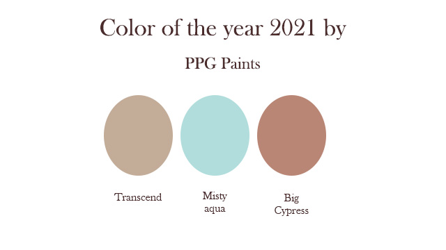
Transcend (R G B – 195:172:152) is a midtone oatmeal color that draws an earthy influence which is much similar to warmer tones selected by other paint companies.
Big Cypress (R G B – 185:134:117) is a shaded ginger with persimmon undertone. It is equivalent to the clay family tones from Benjamin Moore and Sherwin-williams.
Misty Aqua is corresponding with the Blue-Green mix Aegean Teal by Benjamin Moore. It provides an unexpected pairing of freshness against the other warm earthy tones.
The Color trend for the year 2021 by PANTON :
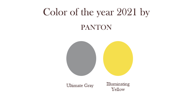
Depending on the current situation that entire world is facing, PANTONE have encapsulated the deeper feeling of thoughtfullness with the promise of conclusion. The two independent colors, the Ultimate Gray and Illuminating Yellow are the color of the year 2021 published by PANTON. The union of these two colors expresses positivity brace with fortitude.

Yellow and Gray can combine with neutrals, mainly white and black to achieve the contemporary style in the space. Adding complementary purple touches to the palette can create drama in the composition.
The Color trend for the year 2021-accessories and elements :
The entire palette of colors consists of softer, warmer, and earthy neutral hues that can easily blend into any interiors style. i.e., Minimal, Scandinavian, Transitional, and Boho. These tones can be introduced rather than paint on an accent wall; these colors can harmonize interiors by associating them in furniture and furnishing. Considering LRV values of the Darker Hues, it is advisable to pair them with soft white and pale neutral in a 60:30:10 ratio. Combining neutrals would create a balance and contrast in the composition.
To achieve a pure minimalistic expression, integrate furniture in Pale wood or natural wooden textures, furnishing in rich leather and textured textiles, natural stone and marble components, and mixed metal accessories.
The color trend for the year 2021 is pure tantalizing yet the palette that you choose for your space should make you feel good and reflect your style., think and evaluate your taste, and the sensations you want to feel in different spaces.
